
v3 Overlay Designer
v3 Overlay Designer
This is the software's most complex system. Open it by clicking Open v3 Overlay Designer in Overlay Window Management.
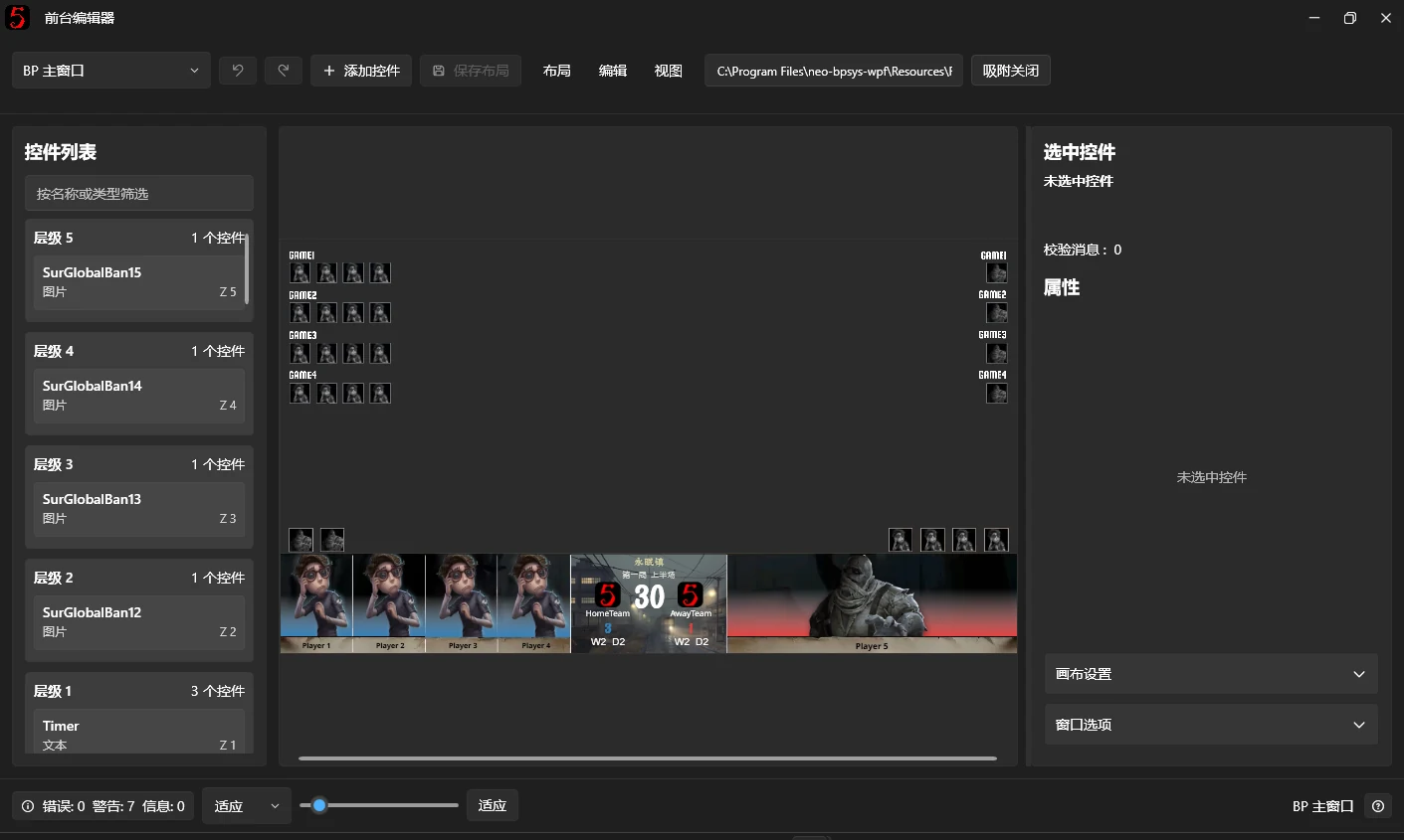
The v3 Overlay Designer customizes broadcast overlays. Edit window backgrounds, control positions, sizes, styles, Data Bindings, and animation effects, or add and remove controls to create your own BPUI.
Unlike the old designer mode, v3 uses a separate editing window. You do not edit directly on the output window, and editing does not directly interfere with footage being captured by OBS.
1. Open the designer
Select Overlay Window Management in the left navigation and click Open v3 Overlay Designer.
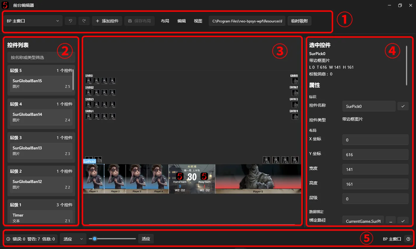
The designer has these main areas:
- Top Toolbar: switch the overlay window being edited, add controls, save layouts, undo, and redo.
- Layers Panel on the left: lists all controls in the current window for quick selection and Z-order adjustment.
- Preview Canvas in the center: simulates the overlay window and lets you move and resize controls with the mouse.
- Properties Panel on the right: edits the selected control's size, position, text, images, Data Bindings, and Animation Behaviors.
- Status Bar at the bottom: shows Layout Validation status and offers canvas zoom and fit-to-window controls.
Select an overlay window to edit
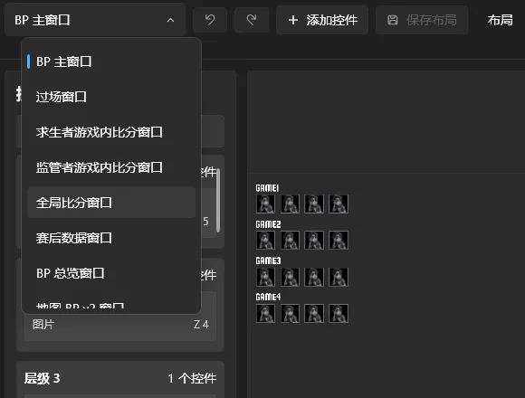
Use the window selector on the left of the toolbar to select a window, such as Main BP Window, Transition Window, or Overall Score Window.
The designer edits one window at a time. Each window has its own layout and controls.
If there are unsaved changes when switching windows, the software asks whether to save them.
Adjust the canvas view
For large layouts, use these controls:
| Operation | Function |
|---|---|
| Ctrl + mouse wheel | Zoom the canvas in or out |
| Right-button drag / Space + left-button drag | Pan the canvas |
| Bottom zoom slider | Adjust the canvas zoom level |
| Fit button | Fit the canvas to the editing area |
Zoom only changes the designer preview. It does not change the actual overlay window size or saved control positions.
2. Set up the window and canvas
Before editing controls, check the window size, canvas size, and background image.
Window, canvas, and control are three different concepts:
- Window (Windows): the actual independent output window captured by OBS.
- Canvas (Canvas): the design area inside the window that holds controls. Coordinates are relative to this canvas.
- Control (Control): an element on the canvas, such as text, an image, character artwork, or a score.
1. Window options
Expand Window Options on the right.
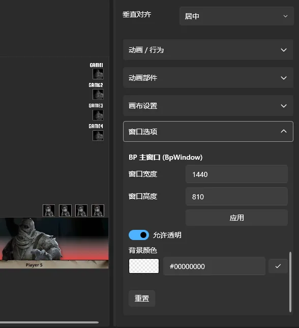
You can set:
- Window Width / Window Height: the overlay window dimensions.
- Allow Transparency: whether the window uses a transparent background.
- Background Color: the window's own background color. Click the color preview on the left to open the picker. The canvas itself is transparent; for chroma keying, the window provides the color. Colors with alpha can also be used together with Allow Transparency.
Click Apply after changing the window width or height.
Window and canvas dimensions are independent. Resizing the window displays the internal canvas and its controls according to the scaling mode, rather than changing every control's coordinates.
Some window options are saved separately and applied immediately without saving the entire layout. Changing Allow Transparency may automatically recreate the corresponding overlay window.
2. Canvas settings
Expand Canvas Settings on the right.
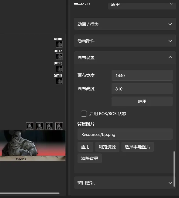
Canvas width and height define the coordinate range used to edit controls.
For example, a 1920 × 1080 canvas uses those design dimensions for control positions.
Click Apply after changing canvas dimensions.
3. Change the background image
The canvas supplies the image commonly referred to as the “UI image”.
Under Canvas Settings → Background Image, you can:
- Click Browse Resources to choose an existing image resource.
- Click Select Local Image to choose a file on your computer.
- Enter an existing resource path manually.
- Click Clear Background to remove the current image.
Local background images are handled by the layout resource management system so they can be included in exported Layout Packages.
Imported images receive a URI identifier such as bpui://local/resources/images/xxx.png. You can also find built-in resources in the resource browser.
Built-in resource URIs usually look like Resources/xxx.png.
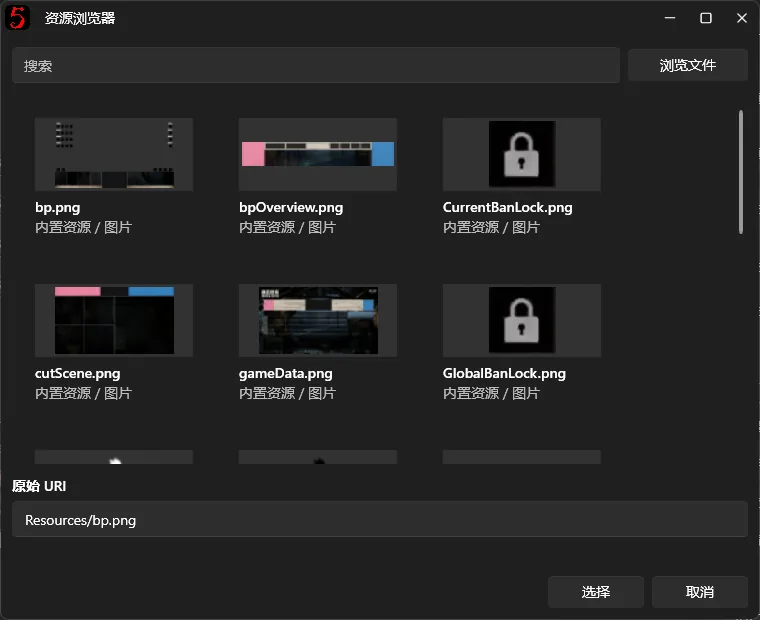
Use common formats such as PNG or JPG, preferably matching the canvas dimensions.
Note: The canvas background image and window background color are separate settings. A complete BPUI commonly uses one background image as a base, with team names, character artwork, and scores layered over it as independent controls.
3. Add and edit controls
Once the canvas is ready, edit the content of the broadcast overlay.
1. Add controls
Click Add Control in the Top Toolbar and select a type.
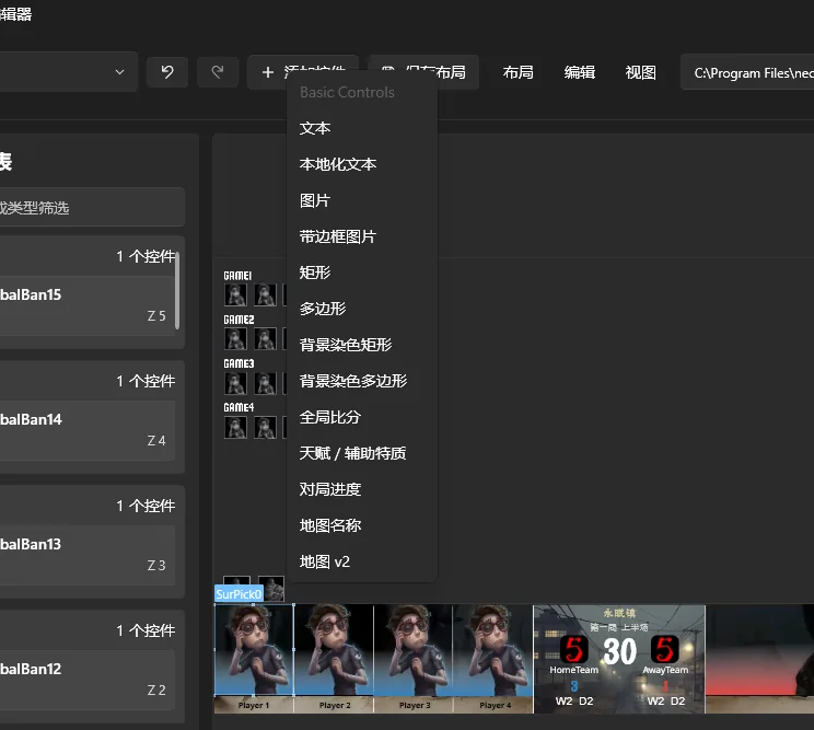
Built-in control types include:
| Control | Purpose |
|---|---|
| Text | Ordinary text, team names, player names, scores, and more |
| Localized Text | Text that follows the software language; you generally need to inspect the source code to find available localization keys |
| Image | Team logos, character images, and more |
| Bordered Image | Images with borders, cropping, and rounded corners; often better than a regular image for adaptive layouts |
| Rectangle / Polygon | Shapes and solid-color or gradient decorations |
| Tinted Rectangle / Tinted Polygon | Shapes that tint the texture behind them; currently used for team theme colors |
| Game progress | Current game number, half, and other progress information |
| Map Name | Current map name |
| Persona talents / Trait | Players' Persona talents and Traits |
| Overall Score | An advanced Composite Control showing overall score rows |
| Map v2 | Map cards for Map BP v2 |
Some controls have dedicated internal editors.
Custom controls supplied by installed plugins that support the v3 designer also appear in this menu.
A new control appears on the canvas and in the Layers Panel, and is selected automatically.
2. Move and resize controls
Click a control on the central canvas.
A selection box and Resize Handles appear around it.
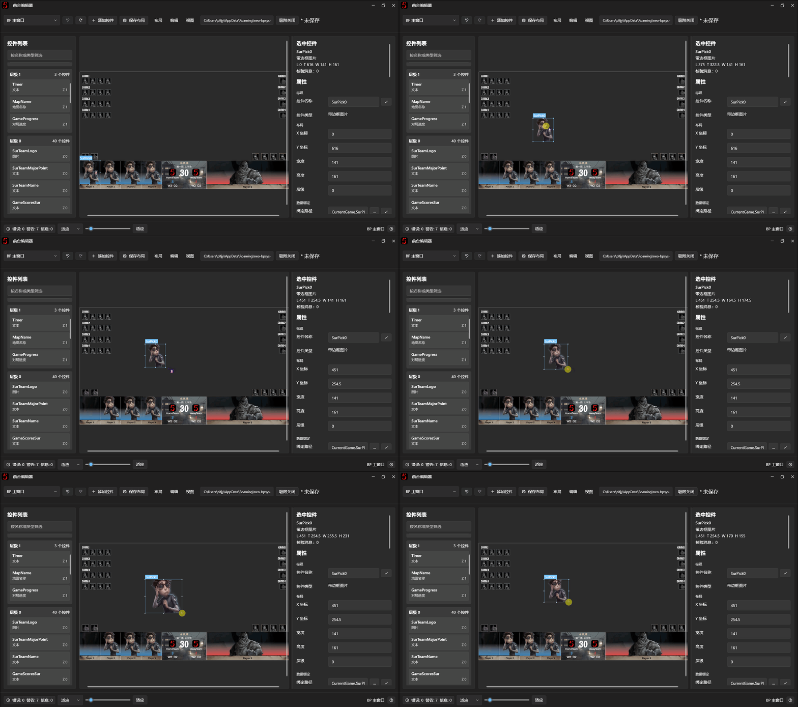
You can:
- Move: drag the selected control.
- Resize: drag its Resize Handles.
- Nudge Position: use the arrow keys.
- Set exact values: enter X, Y, width, and height in the Properties Panel.
If a control is covered by another image, hidden, or fully transparent, select it in the Layers Panel.
Snapping and alignment
The Top Toolbar has a Snapping toggle.
When enabled, moving or resizing controls attempts to align them with canvas edges, center lines, or other controls.
Guides appear when alignment conditions are met.
You can also hold Shift while dragging to enable snapping temporarily without changing the toggle.
3. Edit control properties
Selecting a control shows its properties on the right.
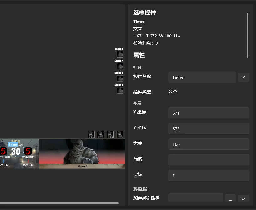
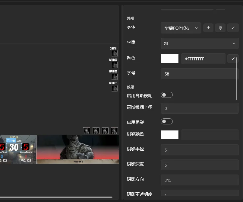
Available properties depend on the control type. Examples include:
- Layout: X/Y coordinates, dimensions, and Z-order.
- Content: static text, image paths, and localization keys.
- Appearance: font, font size, color, image scaling, and opacity.
- Effects: shadows, glow, Gaussian blur, and more.
- Data Binding: update content automatically with match data.
Some properties can be applied to controls of the same type, child controls, or preset layout templates to reduce repeated work.
Most ordinary changes update the preview after you click elsewhere. Properties that can affect other content, such as control names, Binding Paths, and resource paths, require confirmation.
Press Enter or click the adjacent Apply button after editing those properties.
To select multiple controls:
- Drag a selection rectangle with the left mouse button.
- Hold Ctrl and left-click controls on the canvas one by one.
The Properties Panel then shows shared properties. Values that differ appear blank. Editing a shared property applies the change to all selected controls at once.
4. Copy and delete controls
With a control selected, use:
| Shortcut | Function |
|---|---|
| Ctrl + C | Copy controls |
| Ctrl + V | Paste controls |
| Delete | Delete controls |
| Ctrl + Z | Undo |
| Ctrl + Y / Ctrl + Shift + Z | Redo |
Pasted controls receive new names and a small position offset to avoid exact overlap.
Some essential system controls and fixed internal elements of Composite Controls cannot be copied or deleted directly.
Controls can be copied and pasted between window editing views.
5. Adjust layers
The Layers Panel lists the current window's controls by Z-order.
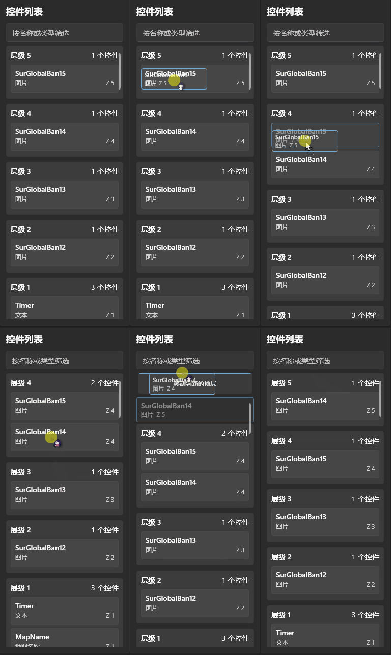
This order is the ZIndex.
Higher values generally place a control above lower ones.
For example, background decoration usually belongs on lower layers, with character artwork, text, and dynamic selection boxes above it.
Drag controls in the Layers Panel to reorder them or move them to another layer.
To move a control above or below all others, drag it to the corresponding drop area at the top or bottom of the panel.
Layer drag-reordering is temporarily disabled while the search box filters the controls. Clear the filter to restore it.
4. Use Data Binding
Data Binding is one of the most important features for creating a BPUI.
Static text and images do not update automatically. With Data Binding, controls update in real time from the operator interface's match data.
For example, bind a Text control to a team name field instead of reopening the designer to edit names for every match.
1. Bind text to match data
To display the Survivor team's name:
- Add or select a Text control.
- Find Text Binding in the Properties Panel.
- Click the button to edit Binding Sources.
- Add a data source in the editor.
- Click Browse Bindings, then find Current Game → Survivor Team → Team Name.
- Confirm the binding and apply the changes.
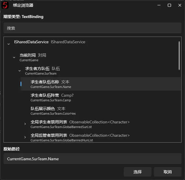
The corresponding path is:
CurrentGame.SurTeam.NameThe overlay text now updates automatically with the current Survivor team name in the operator interface.
The Hunter team name uses:
CurrentGame.HunTeam.NameCombine multiple data sources
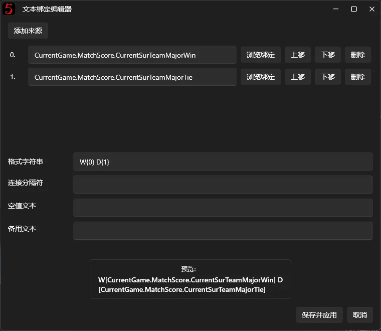
Text Binding supports multiple sources combined with a format string.
For example, after adding two sources, reference them as {0} and {1} in StringFormat.
{0} means the first source, {1} the second, and so on.
If you do not need a custom format, join sources with a separator instead.
Note: A valid Text Binding takes priority over static Text. Static text is used only when no valid Binding Source is configured.
For advanced StringFormat usage, see Microsoft's String.Format method.
Advanced: Dynamic Index Binding
The v3 designer also supports Dynamic Index Binding: another data field can serve as a collection index, and the display updates when that field changes.
An ordinary Binding Path uses a fixed index:
CurrentGame.SurPlayerList[0].Member.Name
Here, [0] always reads the first Survivor player's name.
A dynamic index instead places another Binding Path inside the brackets, and the software obtains the index value automatically.
Example: automatically display the current half's score
Suppose a Text control should always show the current half's score without requiring manual binding changes whenever game progress changes.
Add these two sources in the Text Binding editor:
Source 1: Survivor current half minor score
CurrentGame.MatchScore.HalfByProgress[CurrentGame.GameProgress].SurMinorScore
Source 2: Hunter current half minor score
CurrentGame.MatchScore.HalfByProgress[CurrentGame.GameProgress].HunMinorScore
Then enter this String Format (StringFormat):
{0} : {1}
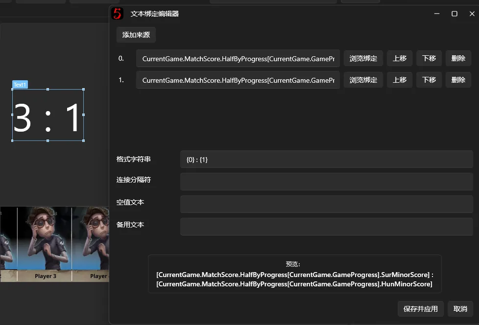
[CurrentGame.GameProgress] reads the current game progress dynamically, and HalfByProgress finds the corresponding half's score.
When the operator interface changes game progress, the binding is recalculated and the text updates automatically.
HalfByProgress also handles the differences between BO3 and BO5 game progress. Use it to obtain the current half's score instead of treating game progress as an ordinary array index.
Rules for dynamic indexes
Dynamic indexes use square brackets [] and support fixed indexes, dynamic fields, and multiple indexes.
For example:
Players[0].Name: reads a fixed index.Players[CurrentGame.SelectedPlayerIndex].Name: uses another field as the index. This is illustrative; make sure the field actually exists.Foo[Bar.Index].Items[Baz.SelectedIndex].Name: uses multiple dynamic indexes in one path.
Brackets may contain only a fixed index or a valid Binding Path. Mathematical operations and conditional expressions cannot be evaluated directly.
For example, Players[CurrentGame.Index + 1].Name is unsupported.
Dynamic indexes belong to BindingPath, which differs from StringFormat:
BindingPathspecifies where data is read from and can use indexes such as[CurrentGame.GameProgress].StringFormatcombines and formats already-read data using placeholders such as{0}and{1}. It also supports standard numeric formats such as{0:F2}.
To display a dynamic field in text, add it as a data source first, then reference it with a placeholder such as {0}. Do not put the Binding Path directly into the format string.
Ordinary bindings are usually sufficient for team names and character images. Dynamic indexes are better suited to selecting different data items according to current game progress or another dynamic state.
2. Bind images to match data
Image controls can display dynamic image data from the operator interface as well as fixed images.
Team logos, player portraits, and character artwork can all update automatically through bindings.
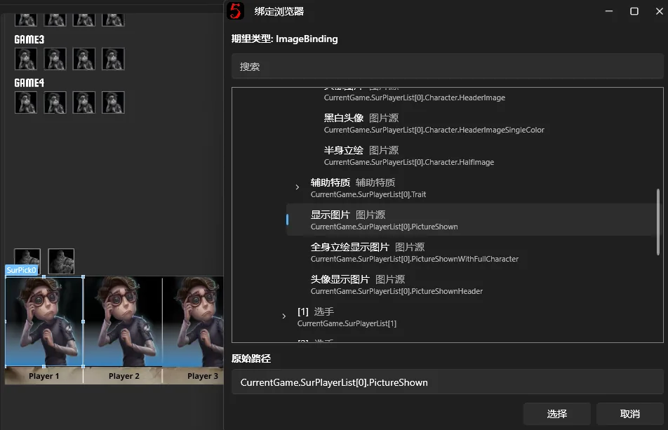
The procedure is similar to text:
- Select an Image or Bordered Image control.
- Find Binding Path.
- Click Browse Bindings.
- Choose the image data to display.
- Confirm and apply.
Distinguish these properties:
- Static Image Path (ImagePath): a fixed image specified by the user.
- Binding Path (BindingPath): an image obtained dynamically from match data.
If both are present, a valid BindingPath takes priority.
3. Change image assets
A fixed image does not need Data Binding.
In Static Image Path, click Browse Resources to select an existing resource or choose a local image. neo-bpsys-wpf processes the image and includes it when exporting the BPUI file.
4. Understand score fields
The designer provides several score fields. Minor scores in particular may look similar while covering different scopes.
The main BP overlay, Post-game Statistics, and overall score do not necessarily use the same field.
If a bound score differs from expectations, check the selected field's meaning first.
See Score System for details.
5. Edit special controls
Some controls combine multiple internal elements rather than being a single image or line of text.
The designer provides dedicated editing tools for them.
1. Overall Score Control
Overall Score displays multiple half-score cells and reads the match scores automatically.
Select the whole score row to adjust its overall position, dimensions, and style.
To edit one cell, select its internal element in the Properties Panel's score-cell list, then adjust its position and style separately.
2. Map v2 control
Map v2 contains map names, map cards, team names, pick borders, and other elements.
Select the control to edit the position, size, and style of its internal parts.
You can apply styles to other map cards for a consistent appearance while retaining each card's map identity and Data Bindings.
Some internal elements cannot be deleted or dragged out as independent top-level controls because they belong to the parent Composite Control.
6. Create BO3 and BO5 layouts separately
Enable BO mode states if BO3 and BO5 matches need different overlay layouts.
For example, score-cell counts, positions, or backgrounds may differ. You do not need two complete Layout Packages for this.
Setup
- Open Canvas Settings on the right.
- Check Enable BO3/BO5 States.
- Select BO5 or BO3 under Current Editing State.
- Edit the background and controls for each state.
- Save the layout.
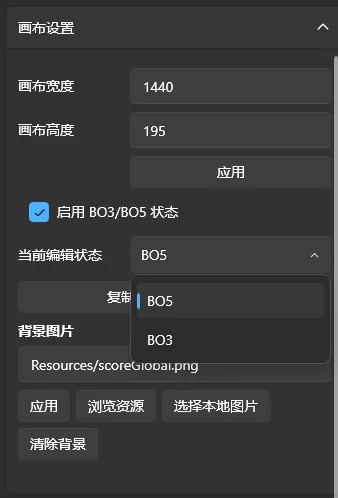
Usually, finish the BO5 layout first, click Copy BO5 Layout to BO3, then adjust score cells, backgrounds, and other controls for BO3.
After copying, the states can be edited separately.
During a broadcast, the software uses the layout state matching the BO3 or BO5 mode currently selected in the operator interface. You do not need to open the designer to switch it.
Note: Copy BO5 Layout to BO3 overwrites the existing BO3 layout. Check before proceeding.
7. Create animations and behaviors
The Animation Behavior system lets controls animate automatically in response to match operations.
For example:
- Fade in character artwork after a pick.
- Animate text or images when game progress changes.
- Pulse a control during Ban/Pick.
- Trigger animations when scores, maps, or team information change.
The system consists mainly of behaviors, triggers, and Node Graphs.
1. Create a behavior
Select the control, then open Animation / Behaviors on the right.
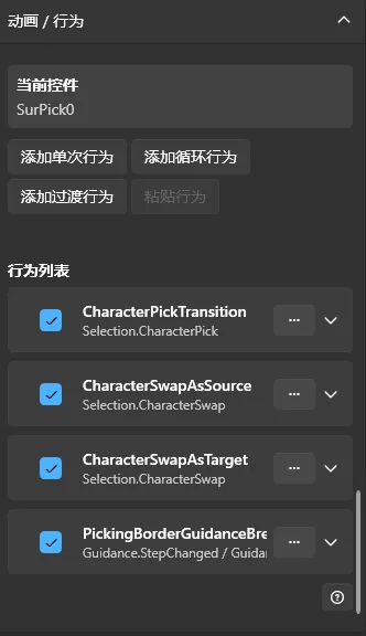
Use the buttons to create one of three behavior types:
| Behavior | Description |
|---|---|
| One-shot Behavior | Runs once when its conditions are met |
| Looping Behavior | Loops after its start conditions are met until its stop conditions are met |
| Transition Behavior | Plays exit and entry animations before and after specific match data changes |
A One-shot Behavior is usually enough for a simple reveal.
Looping Behaviors suit pulsing highlights and continuous flashing.
Transition Behaviors suit character picks and swaps, where animations play on either side of a data update.
2. Set triggers
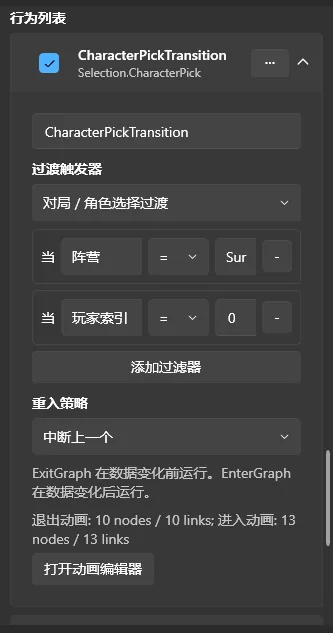
Each behavior can have a Trigger that determines when it runs.
Examples include:
- Window shown.
- Control loaded.
- Character picked.
- Character banned.
- Score changed.
- Map changed.
- Game progress changed.
After creating a behavior, choose the event type under Trigger.
Use Filters to restrict it to specific conditions.
For example, filter a character-pick event by faction and index so that the animation runs only when a particular Survivor slot changes.
Filters support comparisons such as equals, not equals, greater than, less than, and contains. Available fields and operators depend on the event type.
3. Edit the Animation Node Graph
After setting the behavior and Trigger, click Open Animation Editor.
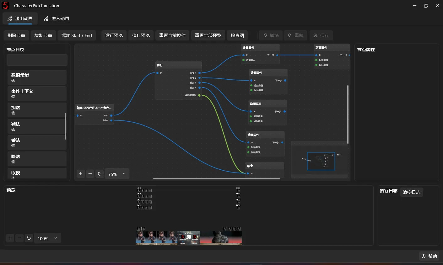
The graph arranges animations visually.
The node catalog is on the left, the editing canvas in the center, and selected-node properties on the right.
Common nodes include:
| Node | Function |
|---|---|
| Start | Animation entry point |
| End | Animation end |
| Delay | Wait a specified time |
| Parallel | Run multiple branches concurrently |
| If | Choose a route based on a condition |
| Set Property SetProperty | Set a control property directly |
| Reset Property ResetProperty | Reset a control property |
| Animate Property AnimateProperty | Animate between two property values |
Drag nodes from the catalog to the canvas, then connect an output port to another node's input port.
Example: create a fade-in
To make a simple opacity fade-in:
- Create a One-shot Behavior.
- Choose a suitable Trigger, such as Control Loaded.
- Open the Animation Editor.
- Add Start, Animate Property, and End nodes.
- Connect them in that order.
- Select Animate Property and set the target and property.
Example parameters:
| Property | Value |
|---|---|
| Target | Self |
| PropertyName | Opacity |
| From | 0 |
| To | 1 |
| DurationMs | 300 |
| Easing | Linear |
| Wait for completion | True |
Self means the control that owns the behavior.
Opacity is fully transparent at 0 and fully opaque at 1.
DurationMs is in milliseconds, so 300 means 0.3 seconds.
When triggered, the control gradually becomes opaque from fully transparent.
4. Preview animations
After completing the graph, click Run Preview at the top.
The animation runs in the designer preview without operating the live broadcast output directly.
If it fails, check:
- Whether Start is connected to subsequent nodes.
- Whether the target and property are correct.
- Whether node parameters contain errors.
- Whether the animation needs event data that has not been supplied.
See the execution log at the bottom for results.
After previewing, click Reset Current Target or Reset All Previews to restore properties changed by the animation.
For Looping Behaviors, preview the start, loop, and stop graphs separately to check each stage.
Remember to save both the Animation Node Graph and the designer changes.
5. Customize animation parts
Use Animation Parts when an animation needs additional visual elements.
These parts are attached inside the current control and do not appear as ordinary independent controls in the Layers Panel.
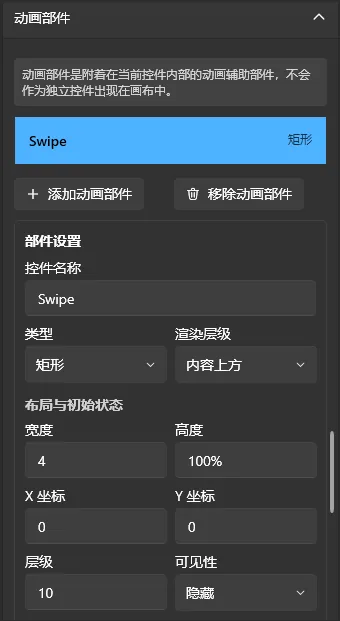
Supported types currently include:
- Rectangle.
- Border.
- Image.
Each part has position, size, color, opacity, rendering order, and other properties.
For example, put a scanning line over a character image and use behavior nodes to animate its position and opacity.
Parts can also sit behind the control's content for backgrounds or accent effects.
Click Apply Animation Part Changes when finished.
8. Save and check layouts
Click Save Layout at the top or press Ctrl + S.
The designer validates the layout when saving. Blocking errors prevent saving and display an error message.
Normal edits made through the v3 designer generally do not cause problems.
1. View Validation Messages
Click the status information button at the bottom to open validation details.
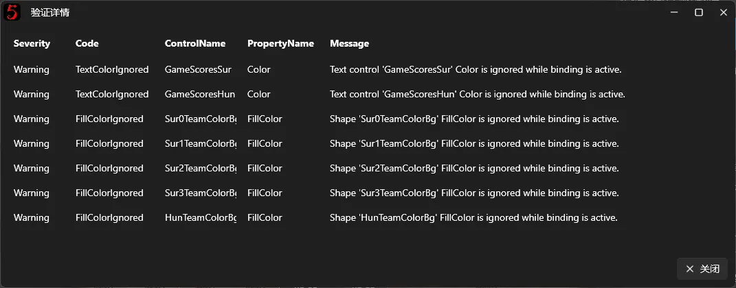
Usually, Warning messages can be left alone; focus on Error messages. Validation messages are in English. If needed, use a screenshot to ask an AI for a translation.
Common problems include:
- Duplicate or invalid control names.
- Invalid property values.
- Incorrect Binding Paths or resource paths.
- Missing referenced images.
- Missing plugin controls or events.
2. Built-in and User Layouts
The software's Built-in Layouts cannot normally be overwritten directly.
When you first save edits to a built-in layout, the software automatically creates a new editable User Layout.
Subsequent changes are saved in that layout without overwriting built-in resources.
Even after extensive edits, you can switch back to the built-in layout through Layout Package management.
3. Reload and reset
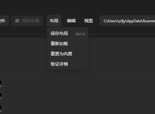
The Layout menu also offers:
- Reload: read the current layout again.
- Reset to Built-in: restore the current window's built-in layout.
- Validation Details: inspect layout problems.
Before reloading or resetting, save any changes you want to keep or create a Layout Copy in Layout Package management.
4. Check the actual overlay window
After saving successfully, the software attempts to reload the corresponding overlay layout.
Return to Overlay Window Management and open that window to inspect its actual output.
Preview data is different from real match data. Change team names, characters, maps, and scores in the operator interface to verify bindings and animations.
Before a tournament, also check transparent backgrounds, dimensions, content positions, and capture results for windows used in OBS.
9. Import and export Layout Packages
The designer packages and shares layouts as .bpui files.
Open the Layout Packages tab in Overlay Window Management to manage installed packages.
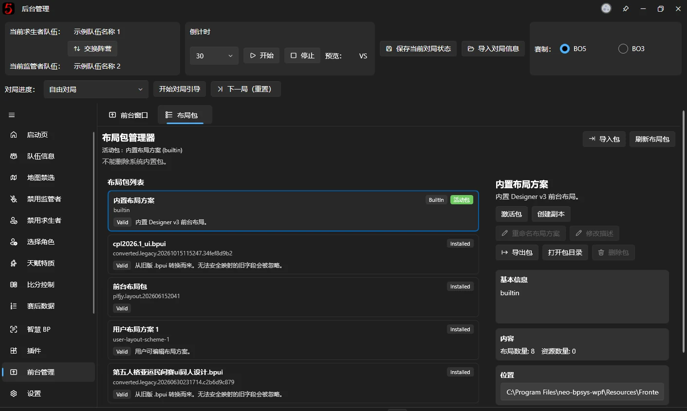
1. Activate a Layout Package
Select and activate the package you want to use.
The software then uses its overlay layouts and Animation Behaviors.
Existing v3 overlay windows also reload their corresponding layouts when packages change.
Switch packages before the live broadcast starts.
2. Create a Layout Copy
To modify an existing layout while preserving the original, create a copy in package management and activate the copy for editing.
This lets you keep the original and produce BPUI variants for different tournaments.
3. Export a Layout Package
Select the layout to share and click Export.
Enter its name, author, description, and other information, then choose a save location to create a .bpui file.
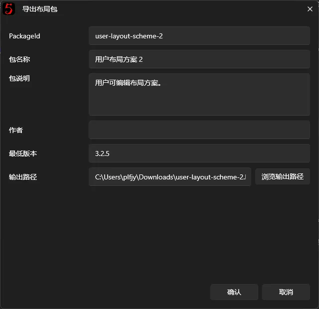
A v3 package can include:
- Overlay window layouts.
- Control settings and Animation Behaviors.
- Referenced resources such as images and fonts.
- Package name, author, version, and other metadata.
It does not include all software settings or plugin programs. Packages that depend on plugins show a plugin-control compatibility notice after import; the notice itself does not prevent use.
4. Import a Layout Package
Click Import on the Layout Packages page and choose a .bpui file.
The software checks its format and contents and installs it in the package list.
If it uses plugins that are not installed locally, dependency notices may appear.
Install or enable missing plugins before use to avoid absent overlay content.
Older .bpui packages from v2 and earlier can also be converted to v3 during import, but exact restoration of every element is not guaranteed.
Check controls, images, scores, and other dynamic content individually after importing an old layout.
10. Create a Custom Overlay Window
v3 also supports new overlay windows in addition to editing built-in ones.
Use this feature for an independent output window that the software does not already provide.
On the overlay windows page in Overlay Window Management, click Create Custom Window.
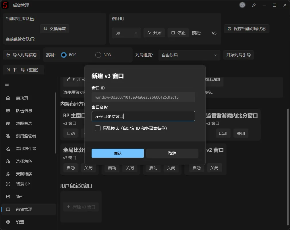
Enter a name and confirm. The software creates a blank overlay window and opens it in the v3 designer.
Add a background, controls, bindings, and Animation Behaviors as with ordinary overlay windows.
The new window also appears in management, where it can be opened or closed independently and captured by OBS.
Custom windows belong to the current Layout Package. Switching to another package does not keep the original package's windows in the new package's window list.
11. Other notes
- Save often. Not every designer operation is saved to disk immediately. Press Ctrl + S after editing controls, animations, or Data Bindings.
- Prefer Data Binding. Dynamic team names, player images, maps, characters, and scores should use bindings instead of fixed text or images.
- Do not delete essential system controls casually. Some built-in layouts have special controls tied to match operations. Deleting or misconfiguring them can stop content updates and take considerable effort to repair.
- Use animation in moderation. Many simultaneous animations and image effects increase rendering load. Test the finished layout in the actual broadcast environment.
- Check before going live. Especially after extensive edits, test picks, bans, side switching, score updates, and BO3/BO5 switching from start to finish.
For more help, click Help at the designer's lower right to read the built-in instructions, or contact the development team through GitHub Issues or the QQ group.